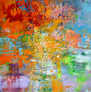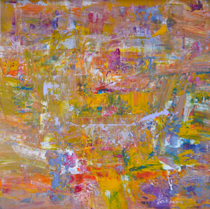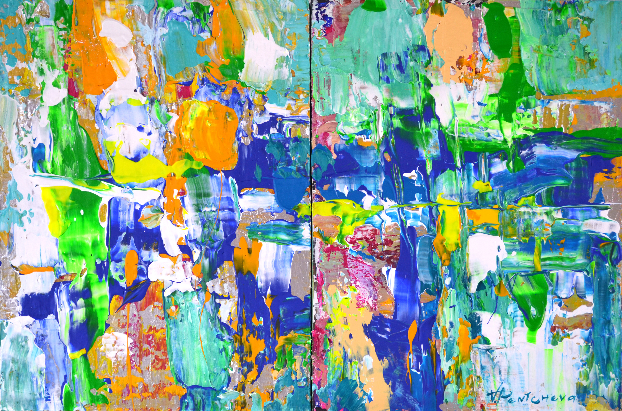
Hope And Harmony 5. Diptych
Door Vania Bouwmeester Pentcheva, 2022
40cm x 60cm x 4cm
A spontaneous, heavy-textured composition of primary colours. Blue, the most calming colour, is most likely to give you peace, stability and guidance to hope. The primary colour, yellow produces a warming effect and arouses happiness. The soft green colour, which comes from yellow and blue combined, is essential to adding harmony. The painting focuses on enhancing happiness, hope and harmony and ultimately leads to more blissful living.
prijs op aanvraag
Techniek
Two-dimensional | Schilderkunst | Acryl | Op doek
Tags
Yellow Blue Green Silver Harmony
Over Vania Bouwmeester Pentcheva

In mijn werk vertaal ik complexe emoties naar kleur, textuur en gelaagde verf. De composities ontstaan intuïtief, terwijl ik zoek naar balans en harmonie.